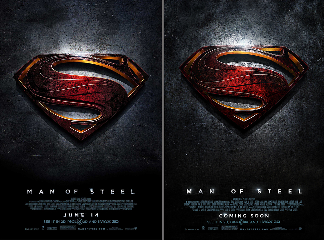
The “Man Of Steel” teaser poster immediately captivated my attention when I first saw it at the movie theater. Bold decisions were made to incorporate several swooshes through the iconic “S” to give it more of an alien vibe and making it grittier looking was quite the departure from the squeaky clean classic version. The steel background was brilliant, reinforcing the name of the film, as well as focusing your eyes on the warm red & gold colors. Speaking of the warm colors, I also loved how the brightness of both colors are confined to just a few key spots in the composition, which supports the “teaser” quality The original poster is on the left and my efforts are on the right. I did make one conscious change, which was raising the “S” icon up a bit to make the overall composition feel more vertical. Unfortunately, I do not know who the original artist is, but I certainly tip my hat to whoever had the vision.


Recent Comments